Here’s are the reasons how Color Psychology Matter in Branding. Color involves every aspect of designing from marketing and branding.
Colour is one of the most aspects which gives the brand a personality and helps in its positioning. Color plays a larger role in marketing and branding than most people are aware of.
Have you experience this-
Q. Do you feel calm when surrounded by green fields and blue skies?
Q. Have you ever asked what does the color red represent and why you feel alarmed when staring at a red stop sign?
What is Color Psychology?
Color psychology is the study of colors about human behavior. By analyzing how a range of colors brings out the emotions and spark reactions in people. Affecting our day to day decisions like the items we buy.
Q. Does the clothes color compel us into the buying?
Q. Do the colors of a package make us pick one brand over another?
Q. Does the color of an icon make us more likely to click on it?
The simple answer is yes.
Color meanings can have an impact on why we prefer specific colors over others.
The same color can also have several implications that are dependent on –
upbringing, gender, location, values, and a variety of other factors.
Color psychology later can help build a strong, relatable brand.
Why does Color Psychology Matter in Branding?
Colors reveal your brand’s major values. By seeing your product packaging or your website.
For example, your target audiences will know who you are, what you sell, and what you’re about.
Color is the first thing that people see and registered in the human brain.
Before typography and/or other images.
Index of color psychology
Red color meaning
Marketing colors like red can capture attention. The most intense color. It provokes the strongest emotions, like triggering, danger, excitement. Designers can use the color for Buy Now, Click Here, Exit, buy or complete an action like subscribe, etc.
Several brands use red for ‘order now’ buttons or for their packaging as a way to stand out on the shelf. save it for the ‘call to action’ or when having a sale so that it contrasts with the website design.
It can trigger hunger and creates a sense of urgency which makes it good for impulse buys. It has the longest wavelength and a characteristic of appearing to be nearer than it actually is.
Red is also arousing and desirable. And affects the body by raising your blood pressure and heart rate. It creates a rush within the body. This color makes us stop and look at it.
Do have a look at space design done for Yamaha balancing the brand color Red.
Red Depicts:
Power | Energetic | Aggressive | Passion | Bold | Youthful | Love | Aggression | Strength | Energy | Excitement | Emotion
Brand Examples:
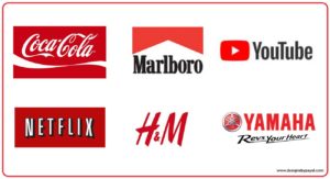
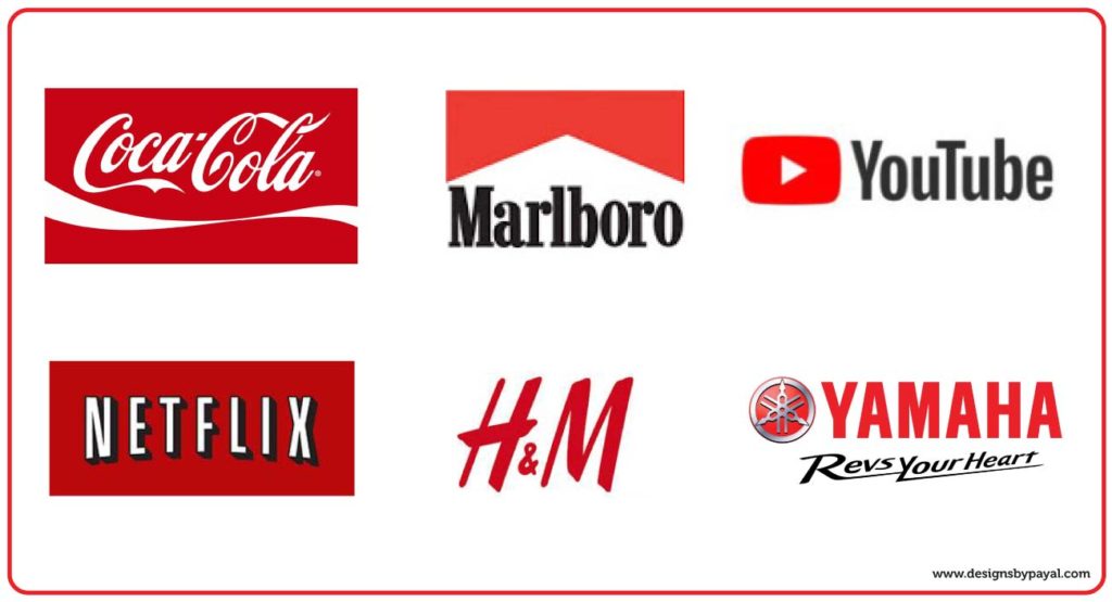
Coca Cola, Marlboro, YouTube, Netflix, H&M, Yamaha.
Blue color meaning.
Blue’s color associated with both water and sky, giving it a calming and peaceful effect. Blue represents stability, trust, peace, harmony, and calm. It soothes your mind. It linked to consciousness and intellect.
Blue can make your brand appear reliable and trustworthy. Blue induces a calming effect on the body, making us feel safe, secure, strengthen the concept of trust.
The color blue for its Relaxing and calmness effect. Used for Sleepezee Mattress by Designs by Payal. Helping customers associate their brands with quality, reliable, and safe products.
Blue depicts:
Relax | Calm | Logic | Communication | Intelligence | Coolness | Stability | Trust | Purity | Serenity
Brand Examples:
Facebook, Ford, Twitter, IBM, Walmart, Paytm.

Yellow color meaning.
The yellow color associating with sunshine. Evoking feelings of happiness, summer, positivity, and optimism. Yet, also warning and deceit. Yellow has a long wavelength and noticed before any other color. Companies dealing in children’s products tend to use yellow the most.
Yellow is a friendly color, invoking feelings of cheerfulness and well-being. It also associated with high energy, youthfulness, and enthusiasm.
Yellow grabs your attention and can also be a sign of caution, sale, or free shipping section. A nice touch of yellow can make your website visitors associate your site with a positive feel.
The yellow color used in Migo Studio Branding for its creativity and friendly space.
Yellow depicts:
Happiness | Optimism | Friendliness | Confidence | Optimism | Cheerfulness | Creativity | Spirit
Brand Examples:
Snapchat, McDonald’s, IKEA, Forever 21, Chupa Chups, Subway.

Orange color meaning.
When red’s power combined with yellow’s confidence, we come up with motivating Orange. In color psychology, orange adds a bit of fun and warmness to any picture, website, or marketing material it’s on. Even though it’s an attractive color, it’s not as commanding as the color red. Many marketers still use the orange tone for the call to actions or areas of a website that they wish to draw the eye too.
Orange is very like yellow in the mind’s eye. It is seen as exciting and sociable. Orange is the color of positivity. It lends motivation to lift up, add up fun to a dull or boring place and is comforting to see at. Represents the creativity, playfulness, and enthusiasm that children represent
Orange depicts:
Warmth | Motivation | Fun | Food | Comfort | Freedom | Adventure | Creativity | Enthusiasm | Success | Balance | Playful | Fun
Brand Examples:
Amazon, Harley Davidson, Nickelodeon, Fanta, KTM, JBL.

Green color meaning.
Green associated with nature and money (think US dollars). Brands looking to convey health, environment, growth, fertility, and generosity. Green can carry negative associations like envy. If you’re in the vegan, lifestyle, health, or fitness niche, then green is ideal for packaging and branding.
Green represents balance and harmony. Often used in brands to promote environmentally-friendly campaigns, nature imagery. To attract a more niche demographic, like outdoor enthusiasts and millennials. It associated with peace, earth, and universal love.
Green is also one of the most seen colors. We tend to relate it with balance and is peaceful like nature. Dark green is also associated with wealth and money.
Happy Roots project green color connects to nature, health, and positivity.
Green depicts:
Peace | Health | Nature | Reassurance | Universal Love | Energy | Harmony | Balance | Equilibrium | Reliability | Growth
Brand Examples:
Animal Planet, Tropicana, Starbucks, Heineken, Land Rover, Spotify.

Pink color meaning.
Pink is a popular color for brands that serve a female audience or wish to convey an element of feminity. Pink’s revolves around playfulness, immaturity, and unconditional love. Few brands have chosen the color pink for their product packaging, especially for girl’s toys.
Kreative Kakez. It highlights the pink color in its logo, branding, and marketing collateral. Conveying – playfulness, sweet, and soft in their approach.
Pink depicts:
Soft | Feminine | Love | Romance | Sweetness | Sexy | Daring | Playfulness
Brand Examples:
Victoria’s Secret, Baskin Robbins, Cosmopolitan, Barbie, LG, Hello Kitty.

Violet color meaning.
In color psychology, violet is a regal color. Violet connects to power, royalty, nobility, luxury, wisdom, and spirituality. Digital marketers should avoid using the color too much as it can cause feelings of arrogance.
Violet has the power of red combined with the intellect and stability of blue. Violet is a spiritual color. It soothes. Many companies which stand out as being original and different use violet in their logos
Checkout, How violet color conveyed decadence with luxury in the Dezart Frozen Delight project.
Violet depicts:
Royalty | Wisdom | Respect | Spirituality | Mystery | Vision | Calmness | Truth | Authenticity
Brand Examples:
Cadbury, Yahoo, Taco Bell, Hallmark, FedEx, Wonka.

Brown color meaning.
A mixture of red, yellow, and black. It has the power of red, warmth of yellow, and the seriousness of black. Most of the time it used to represent products coming from nature.
Like green, brown is an earthy color, associated with wood, earth, and stone, conveying comfort, security, and a down to earth nature. In marketing, you’ll notice that brown is often used for natural products and food. Brown is a color that shows up in logos, banner, Packaging.
Brown is a protector. It represents the earth. Brown can notice everywhere and that too in things that are solid. Tend to associate it with power and support.
Only HR brand, that takes advantage of the brown color in their Logo Design. Associating with a secure, reliable, dependable.
Brown depicts:
Safe | Dependable | Support | Seriousness | Reliability | Power | Nature | Warmth | Safety
Brand Examples:
Hershey’s, UPS, Lindt, M&M’s, LV, Nespresso.

Black color meaning.
A popular color in many brands. With meaning is symbolic of mystery, with strength, power, elegance, and sophistication. In contrast, black can evoke emotions like sadness and anger. It also symbolize grief and death.
Black is the color of the class. Black is the absence of color. Hence, it has the capability to absorb energy. Black shows clarity. Black doesn’t stand out. It’s a recessive color. But it doesn’t have any hidden meaning. Black’s black. This makes people trust it.
Most brands decide to use black and white photos for lifestyle icons or images. To create a specific tone or consistency on their digital and communication collaterals
Black used in niche companies to state the motto ‘We are who we are’
Flying Duck Co. has used black color for its branding for sophistication and elegant approach
Black Depicts:
Elegant | Glamorous | Powerful | Sophistication | Glamour | Reserved | Seriousness | Control | Clarity | Efficiency
Brand Examples:
Nike, Adidas, Chanel, Apple, Uber, Prada.

Think about your favorite colors,
Then think about the colors of your favorite brands.
Do your lists overlap?
(See how color psychology is an important component of brand psychology?)
Tell me what you think of this article on Psychology of colors in branding in the comments section.